


Design Craft: Cut Files, Fonts
4.239.00 Reviews
App Specs
- Version
- 1.2.21
- Updated On
- License
- Free
- Downloads
- 50,000+
- Developer
- One Music Player
- Categories
- Art & Design
- Platform
- Android
Screenshots
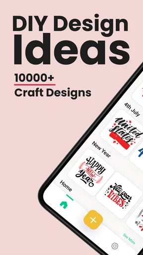
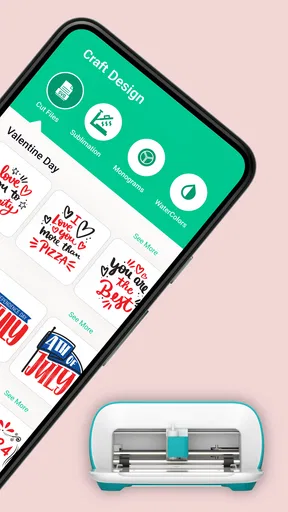
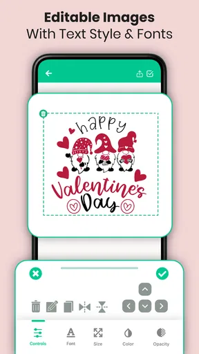
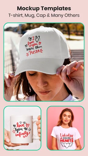
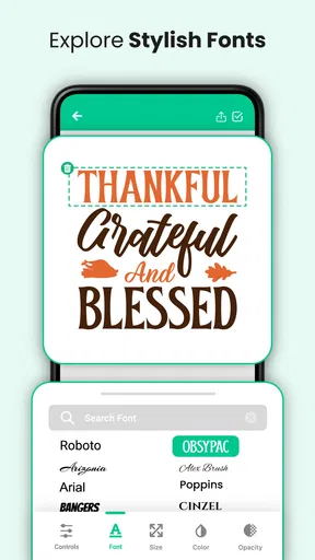
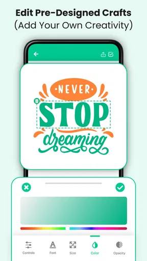
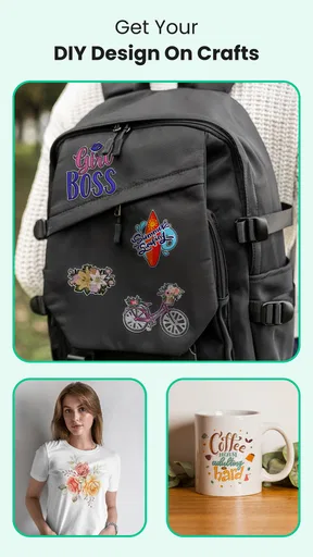
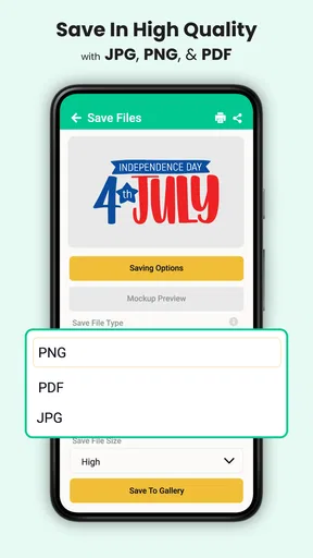
 Analysis by AppCompare
I approached Design Craft: Cut Files, Fonts as a practical art and design tool rather than as a complete replacement for a desktop graphics suite. Its focus is straightforward: help you browse and work with monograms, graphics, and fonts intended for craft projects and cutting machines. That makes it interesting for people who want a quicker starting point than drawing every element from a blank canvas.
What I liked most is the way the app fits a very specific creative moment. You may have a plain mug, label, card, shirt, or sign in mind, but not the time or confidence to build a decorative design from scratch. A library-based app can remove that first barrier. Instead of staring at an empty project, you can begin by looking for a letter arrangement, decorative shape, or font direction that gives the project some character.
It is a free app in the Art & Design category, developed by One Music Player, with an Everyone age rating. The current version is 1.2.21, and it runs on Android 7.0 or later. The app has reached over 50 thousand installs and holds a 4.2 average from more than 200 ratings, so it has found a modest audience without feeling like an enormous, crowded platform.
Where the first attempts can get stuck
The first point of friction is expectation. The phrase “cut files” can make people imagine that the app will handle every stage of a cutting-machine project, from choosing artwork to sending a perfectly prepared job to hardware. I would treat it more carefully: this is best understood as a design resource and preparation tool. The exact handoff to a cutting application or machine depends on the rest of your setup.
That distinction matters because a design that looks attractive on a phone is not automatically ready for physical cutting. Tiny gaps, thin decorative strokes, overlapping letters, and enclosed shapes can behave differently once material, blade settings, and software interpretation enter the picture. I found it more useful to judge each design twice: first for appearance, then for whether its structure seems sensible for the intended craft.
Another place users may hesitate is choosing among similar-looking options. A monogram can appear elegant at a glance, yet the letter order, spacing, and surrounding ornament can change the result completely. I recommend deciding the purpose before browsing deeply. A single initial for a small label needs a different visual balance from a three-letter family monogram or a large sign.
The most useful habit is to separate design selection from production decisions. First decide whether the artwork communicates what you want. Then consider size, material, cutting method, and finishing. Mixing those decisions too early makes it harder to tell whether a problem comes from the design or from the physical process.
Worth Reading Before You Choose
EA SPORTS FC Mobile 26 Is a Bigger Football Game, but It Takes Time
Flipboard Shows What News Apps Must Do Beyond the Feed

Switching to Android Auto Means Rethinking Your Driving Routine
Google Calendar Makes a Crowded Week Easier to Manage
Ludo King Makes the Most of the Minutes Between Plans

Baby Panda World Brings Quick Play to Modern Phones, but Its Game Library Feels Busy
Why previews deserve more attention
On a small screen, decorative fonts can look more open and readable than they really are. I would zoom in before committing to a design, especially when letters touch ornaments or when the design contains narrow internal spaces. A preview is persuasive, but it is not a guarantee that every detail will remain clear after resizing.
This is particularly important for beginners who want to make names or initials. A highly ornate font may look special in the app but become difficult to weed, transfer, or read from a normal distance. For a first project, I would choose a design with clear letter shapes and fewer fragile details, even if a more elaborate option initially looks more impressive.
What the app is best at
The strongest use case is idea generation with a practical destination. Someone preparing personalized gifts, classroom labels, party decorations, simple home signs, or small craft batches can use the library to move past the blank-page stage. It is also useful when you already know the theme but need a visual direction: a monogram for initials, a graphic for decoration, or a font that gives a project a particular mood.
I would not position it as the ideal choice for detailed illustration, advanced typography, or precision layout work. If your project depends on exact vector editing, complex layering, color-managed output, or professional prepress controls, a full design application remains the better tool. Design Craft can contribute an ingredient, but it should not be expected to replace a complete production workflow.
Setup checks before blaming the app
Getting started is easier when the project is defined in advance. Before opening the library, I suggest writing down the text, approximate finished size, material, and intended use. Even a short note such as “one initial for a small vinyl label” gives you a filter for judging fonts and monograms. Without that filter, browsing can become enjoyable but unproductive.
It also helps to check your device before doing serious work. The app supports Android 7.0 and above, but compatibility is only the first check. Keep enough free storage for the app and any design-related files you plan to save or move elsewhere. If the device is nearly full, downloads, previews, or exports in a broader workflow may become unreliable even when the app itself opens normally.
Network conditions can also affect the experience. If a library item takes a long time to appear, do not immediately assume the design is unavailable. Try a stable connection, wait for the preview to finish, and avoid repeatedly tapping the same control. Repeated attempts can create confusion about whether an item was selected, saved, or simply still loading.
The app is free to install, while in-app purchases range from $0.99 to $99.99 per item. I would keep that in mind before treating every visible design or resource as automatically included. Check the purchase prompt carefully and make sure the selected item is the one you actually want. A quick pause here is worthwhile, particularly if you are browsing with a child or sharing a device.
A simple first-project routine
For a first session, I would avoid trying to create an entire collection. Pick one short word or one initial, select a design with generous spacing, and test the workflow from beginning to end. This exposes practical issues earlier: whether the chosen font suits the material, whether the file moves cleanly into the next tool, and whether the final scale preserves the details you liked in the preview.
Choose the project’s purpose and finished size before selecting artwork.
Compare several monograms or fonts at the same intended scale instead of judging them only at preview size.
Look for narrow strokes, isolated dots, and small enclosed areas that may be difficult to handle physically.
Keep the first design simple enough that you can identify the source of any problem.
Record which design and settings worked so the next project starts from a known baseline.
This routine may sound cautious, but it saves time. A failed physical cut costs more than a few extra minutes spent inspecting a design. It also teaches you which visual details are genuinely useful for your materials rather than merely attractive on screen.
Understanding the role of fonts
Fonts are not interchangeable decoration. Their personality changes how a name or phrase feels, but their construction also affects production. Script lettering with many connected strokes can be appealing for a wedding sign, while a cleaner style may be much better for a small label. If you are cutting adhesive vinyl, remember that tiny detached pieces can be easy to lose during weeding.
I recommend testing the actual word you need instead of judging a font with sample letters. Some letter combinations create awkward joins or uneven spacing. A font that looks balanced with a single initial may feel cramped when used for a surname. This is one of the more important practical checks because the problem often appears only after the text is assembled.
Keeping purchases and files organized
If you explore paid items, keep a small record of what you selected and why. A note with the project name and design choice can prevent accidental re-purchases or confusion later. It is also sensible to maintain a separate folder or naming habit for designs that have already been tested, especially if you work on several gifts or seasonal projects.
Do not rely on memory for the final version of a design. Save or transfer it in a way that makes its identity clear, and keep the original untouched when possible. That gives you a clean starting point if you later need to resize the artwork or adapt it for another material.
Recovering when a workflow goes wrong
When a design does not move smoothly from the app to the next stage, I would troubleshoot in layers rather than immediately starting over. First confirm that the selected item is the intended artwork. Then check whether the receiving application supports the file type or import method you are using. Finally, inspect the design itself for elements that may not translate well.
A common mistake is changing several things at once. If you switch fonts, resize the artwork, alter the material, and change cutting settings in one attempt, you lose the ability to identify the real cause. Make one change, test again, and keep notes. This is slower for a single failure but much faster when you are trying to build a repeatable process.
If the preview appears incomplete, give it time to load and retry with a stable connection. If the app becomes unresponsive, close and reopen it before making repeated selections. A clean restart can distinguish a temporary display issue from a problem with one particular design. I would also keep the operating system and app version reasonably current, while remembering that an update can change where controls appear.
When imported artwork looks different elsewhere, compare the original and the transferred version at the same zoom level. Sometimes the issue is not missing content but a change in scale, background display, or how the other application represents transparent areas. Looking at both versions side by side is more informative than judging one from memory.
Separating design problems from machine problems
If the digital design looks correct but the physical result is poor, inspect the material and machine setup before rejecting the artwork. Blade condition, pressure, speed, mat grip, material thickness, and weeding technique can all influence the result. Those variables sit outside Design Craft, so changing the design may only hide the real issue.
For example, a design with small details can fail because the material is not adhering firmly, not because the file is malformed. A large simple shape can also cut badly if the blade needs attention. Testing a basic shape or a short, clear word is a useful control. If the simple test fails too, the app is unlikely to be the main cause.
The same reasoning applies to alignment. If a design arrives at the right proportions but appears misplaced on the material, check the mat orientation and the receiving software’s placement settings. Avoid editing the original artwork until you know the problem is actually inside the design.
When text behaves unexpectedly
Text is a frequent source of confusion because fonts may be handled differently across applications. If a word looks correct in one place and changes in another, confirm whether the receiving workflow is preserving the design as artwork or trying to interpret the text again. Converting text into a stable graphic representation, when your broader workflow supports it, can reduce surprises, but you should preserve an editable copy first.
Spacing problems deserve special attention. A name may look centered mathematically but not visually, particularly when one letter is wide and another is narrow. I prefer to judge the word as a whole and make small visual adjustments in the receiving design tool if necessary. The app can help you find the style, while final alignment may still belong in the tool that controls the finished layout.
When another tool is the better answer
Design Craft is a sensible fit when you want ready-made creative direction and a faster route to personalized craft artwork. It is less suitable if your work depends on building original illustrations from basic shapes, editing nodes precisely, managing complex layers, or preparing files for professional printing. In those cases, a vector editor gives you more control, even if it takes longer to learn.
It may also be the wrong choice for someone who wants a single all-in-one machine ecosystem. If your priority is automatic synchronization with a particular cutter, project management, material presets, and direct machine control, the manufacturer’s own software may provide a more predictable path. That convenience can outweigh the broader browsing experience of a separate design library.
On the other hand, a general image editor may be excessive for a simple monogram. You do not need a large professional application just to explore a few decorative initials or font moods. The advantage here is focus: the app points you toward craft-oriented visual material instead of surrounding a beginner with tools they may never use.
There is also a trade-off between convenience and originality. Starting from prepared graphics can make a project achievable quickly, but it can also lead to designs that feel familiar. I would use the library as a starting point, then personalize the result through wording, scale, arrangement, or material choice. If your goal is a completely distinctive identity system or original illustration, begin elsewhere and use this app only for inspiration.
Who should try it first
I would recommend it to a beginner with a small craft project, a hobbyist who needs fresh starting points, or a maker who regularly creates initials, labels, signs, and personalized gifts. It is especially approachable when you know the message you want but are unsure how to style it.
It can also help an experienced maker who wants to browse quickly on a phone before doing detailed preparation in another application. In that role, it is not the whole workshop; it is the shelf of references and starting materials that helps you decide what direction to take.
I would skip it if you dislike checking files manually, need advanced editing in the same interface, or expect every design to be ready for every machine without adjustment. People who want complete control over every curve may become frustrated, while people who want a one-tap path from idea to finished object may find the surrounding workflow more important than the library itself.
A realistic everyday example
Imagine I need a small set of labels for storage boxes. I would begin with one initial or a short word, choose a readable font, and compare it at the approximate label size rather than at a large preview scale. I would avoid delicate flourishes until I knew the material could hold them. After transferring the design to the next tool, I would test one label before preparing the entire set.
If that test weeds cleanly and remains legible, I can reuse the same visual approach for the remaining boxes. If it fails, I have limited the cost and can decide whether the issue is the font, the size, the material, or the cutter settings. This is where the app earns its place: it helps me make a design decision quickly, while the test keeps that decision grounded in reality.
My practical verdict after using it
Design Craft: Cut Files, Fonts is a focused, free starting point for craft-oriented design. I like it most when I treat it as a source of monograms, graphics, and font ideas rather than as a complete replacement for the software and hardware that finish the project. Its value comes from reducing the blank-page problem and giving a beginner something concrete to evaluate.
The experience becomes much better when you slow down at the right moments: inspect small details, test the exact word you need, separate digital issues from machine issues, and make only one troubleshooting change at a time. Those habits matter more than simply finding the most decorative design in the library.
One Music Player has made a specialized tool for people who want to turn lettering and simple graphics into physical craft projects. The app is worth trying if that describes your needs, especially because installation is free and the age rating is Everyone. Just approach paid resources carefully, keep expectations realistic, and remember that a good-looking preview is the beginning of a craft workflow, not the final quality check.
My recommendation is therefore positive but specific: use it to discover and shape a practical design, then finish the technical preparation in the tool that understands your cutting machine and material. If you work that way, the app can be a convenient creative companion. If you need deep vector control or a fully integrated production system, choose a more specialized alternative instead.
Pros
- Large library of cut files
- fonts
- stickers
- and craft templates
- Useful search and category tools make finding designs quick
- Supports creative projects such as vinyl decals
- cards
- and shirts
- New designs and seasonal content help keep the catalog fresh
- Files can inspire beginners and speed up experienced crafting projects
Cons
- Some premium designs and fonts require a subscription or extra payment
- File quality and cutting results may vary between individual designs
- The catalog can feel overwhelming without more advanced filtering options
- Certain downloads may need additional editing before cutting
- Offline access may be limited for saved or purchased content
FAQs for Design Craft: Cut Files, Fonts
What is Design Craft: Cut Files, Fonts used for?
Design Craft: Cut Files, Fonts is a creative design app aimed at users who make personalized projects, printable artwork, stickers, labels, invitations, and craft decorations. It combines ready-made cut files, decorative graphics, and font resources in one place, helping you create designs without drawing every element from scratch. It can be useful for beginners, hobby crafters, and anyone preparing artwork for compatible cutting or printing workflows.
Does Design Craft: Cut Files, Fonts work with Cricut, Silhouette, or other cutting machines?
The app is primarily intended to help you find or prepare design resources, but compatibility depends on the file format, export options, and the cutting software you use. Before downloading a design, check whether it can be saved or exported in a format supported by your machine, such as SVG, PNG, or another available option. You may still need to transfer the file to Cricut Design Space, Silhouette Studio, or similar software for final settings and cutting.
Are all cut files, fonts, and design resources free in the app?
Not necessarily. Design Craft: Cut Files, Fonts may include free resources, previews, or introductory content, while other designs can require an in-app purchase, subscription, or separate download. Pricing and access can vary by item and may change over time. It is worth checking the product page and purchase screen carefully before confirming anything, especially if you only want occasional designs rather than a larger creative library.
Can beginners use Design Craft: Cut Files, Fonts without professional design experience?
Yes, the app can be approachable for beginners because pre-made cut files and fonts reduce the amount of original artwork you need to create. You can start by browsing categories, selecting a design, and adapting it for your project. However, some basic knowledge of layers, sizing, file formats, and transparent backgrounds is helpful. Users who plan to cut intricate designs may also need to learn how to adjust settings in their machine’s companion software.
Can I use the designs and fonts from the app for commercial projects?
Commercial use should never be assumed simply because a file can be downloaded. Each cut file, illustration, or font may have its own license, including restrictions on selling finished products, distributing digital files, or using designs for business branding. Read the licensing terms associated with every resource before using it commercially. If the license is unclear, contact the developer or rights holder rather than relying on the app’s preview or download description.


